Logo & Color Palette 101: Building a Brand Identity That Sticks

Choosing the Right Logo and Color Palette for Your Small Business
Starting a business is exciting—full of possibility, creativity, and maybe just a little bit of overwhelm. Between launching your products or services, setting up your website, and spreading the word, one of the biggest (and most important) steps is creating your brand identity. And that starts with your logo and color palette.
These two visual elements are often the first impression your business makes. They set the tone for how your audience perceives you, how they feel when they see your brand, and even whether they’ll remember you in the long run. So how do you choose the right ones when you’re just starting out?
Let’s break it down:
Why Your Logo Matters
Your logo is more than just an image—it’s the face of your brand. Think of it as the handshake that introduces your business to the world. A well-designed logo should be:
- Simple and Memorable – Think of the most iconic brands (Nike, Apple, Target). Their logos are straightforward but unforgettable.
- Versatile – Your logo needs to work everywhere: website headers, social media profiles, packaging, business cards, even a tiny Instagram story highlight.
- Aligned with Your Personality – If your business is playful and approachable, your logo should reflect that. If it’s sleek and professional, your design should lean into those vibes.
✨ Pro Tip: Don’t overcomplicate it. A clean, thoughtful design will carry more impact than a busy, cluttered one.
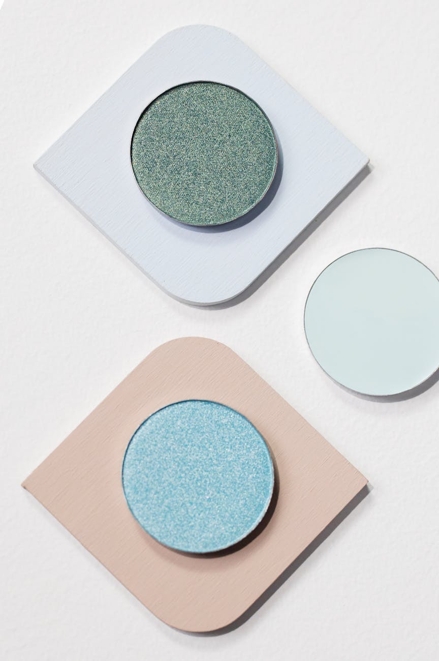
The Power of Color Psychology
Colors speak a language all their own. Before your customer reads a single word of your website, your color palette is already telling them how to feel about your brand. Here’s a quick guide:
- Blue → Trust, reliability, professionalism (great for finance, tech, or wellness).
- Green → Growth, nature, freshness (perfect for eco-friendly, health, or landscaping businesses).
- Yellow → Optimism, energy, creativity (ideal for brands that want to inspire joy).
- Black/White/Neutrals → Luxury, minimalism, timelessness (a good fit for fashion, beauty, or creative services).
- Pink/Purple → Creativity, imagination, and often a sense of uniqueness or playfulness.
When choosing your palette, consider:
- Primary Color: The star of your brand (used most often).
- Secondary Colors: Supporting players that add variety.
- Neutral Tones: Backgrounds, text, and balance.
Tips for Choosing the Right Combination
- Know Your Audience – Who are you trying to attract? A youthful audience might respond better to bold, vibrant colors, while a luxury-focused audience may prefer muted tones.
- Stay Consistent – Consistency builds recognition. Stick to your chosen palette across all platforms and materials.
- Keep It Timeless – Trends come and go, but your logo and colors should feel relevant for years to come.
- Test It Out – Mock up your logo and colors on different platforms: Instagram feeds, business cards, or a sample website. Does it feel right across the board?

Bringing It All Together
Your logo and color palette aren’t just design choices—they’re the foundation of your brand identity. They tell your story, set the tone, and create the emotional connection that makes customers trust and remember you.
At The Social Edit by Jules, I help small business owners like you craft logos, palettes, and brand assets that feel authentic, modern, and memorable. Because your business deserves more than a random color picker and a generic template—it deserves a brand that truly represents you.
✨ Ready to create a brand identity you’ll be proud to show off? Let’s chat about your logo and color palette today.


Leave a comment